
How to Make a Shaker Kitchen Feel Timeless, Not Twee
There is a fine line between a classic kitchen and one that looks as though Miss Havisham will pop...
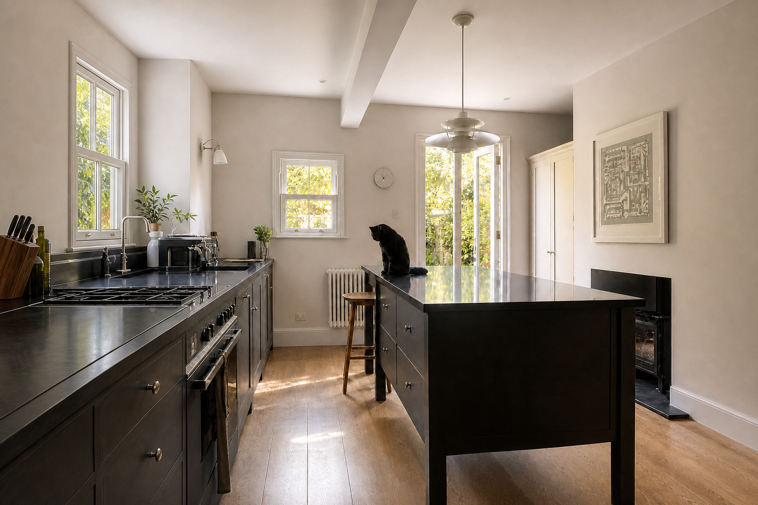
My north-facing Victorian kitchen needed more space and more light. The standard answer was a side return. Instead, I kept the garden, protected the dining room and made the existing space work harder.
Avoid the perpetual London 'what to do with this space' dilemma.
Better upfront planning beats extra square metres every time.
Storage, laundry and appliances all carefully considered,
The kitchen we inherited in our Tunbridge Wells townhouse was a familiar arrangement: a narrow cooking area with a utility/pantry alongside it, and a dining room sitting in the middle of our house.
That has all the ingredients of the standard renovation brief. Fill in the side return, add glass, make everything bigger.
Except that would have solved one problem by creating two more. A side return would have taken useful outside space and left the dining room even more internal, dependent on borrowed light. I didn’t want to lose garden for more kitchen, or make one room worse to make another bigger.
So the brief became simple: make the existing footprint work harder. The kitchen and utility became one room. The opening to the dining room was widened, so light now travels further into the centre of the house.
The kitchen we created has proportion, daylight, a strong connection to the garden and enough storage to work hard without looking as though it does.
Side returns are now so familiar in Victorian houses that they’re treated as the obvious answer. Some think they can be transformative, but for me they also create a large rear room at the expense of the space behind it, particularly where a dining room already sits in the middle of the plan.
That was the deal-breaker here. The dining room was already the darker room, and I wasn’t prepared to make it darker for a larger kitchen. There was also a loss that never appears on the glossy floorplan: the strip outside where bikes, bins and garden tools quietly live.
Joining the kitchen and utility gave me the working space I needed. Widening the opening to the dining room did something more valuable, letting the two rooms borrow light from each other while keeping the original sequence of the house legible. Opening up doesn’t have to mean flattening everything.
Steal this
Before you measure what you’d gain inside, measure what you’d lose outside.
Extensions are usually measured by what they add. It’s worth measuring what they take away. Sometimes the luxury is the space you choose not to build on.
Our dining room kept its French doors to the garden. In the kitchen, I moved and replaced the UPVC door with tall, simple glazed hardwood doors. No bifolds, and none of the black metal grids that are everywhere right now. They’ll date the same way black and rose gold taps have. Architecture ages better when the intervention belongs to the building rather than announcing the year it was renovated.
The tiny original pantry window stayed. It does very little in practical terms and quite a lot architecturally. Remove enough quirks like that and you’re left with a period exterior wrapped around a generic interior.
Steal this
Tall, simply glazed doors, and keep whichever small original detail your house still has.
North light is cool and flat, and pale shades can look grey and washed out in it. A warmer, more complex colour gives the room depth.
The starting point was a deVOL kitchen I’d seen in Regent’s Park: simple, confident and painted in Farrow & Ball’s Salon Drab, which I describe as a lucious mix of chocolate and broccoli. A visit to the deVOL showroom in Clerkenwell settled it, and I’d recommend a trip for inspiration whether or not you buy. I chose deVOL for the choice, the bespoke design, and how easy they are to work with. And off course we were able to have our cabinets custom-painted in Salon Drab.
The tall pantry and fridge freezer cupboards are in deVOL’s softer Mushroom. One dark colour across every tall surface would have made the room feel heavy. This way the darker tone anchors the working kitchen and the paler cupboards recede.
Walls, ceilings, woodwork and radiators are Farrow & Ball's Strong White. Despite the name, it isn’t bright: next to pure white it feels dark, yet in north light it stays soft and calm.
Steal this
One warm, dark colour low down, a softer shade for the tall cupboards and some artwork to bring a pop of colour. We opted for a gorgeous Eduardo Paolozzi.
There are no wall cupboards. My husband is an architect, so they were never going to happen, and once you remove them a kitchen immediately feels less like a kitchen.
That only works if everything else has somewhere to go. For us two tall pantry cupboards do the heavy lifting, with the microwave and small appliances hidden inside. The cooker is a matt black induction range with downdraft extraction, which pulls steam away at the hob, so there’s no hood on the wall or ceiling to break the lines. The washing machine, dryer and boiler moved upstairs into a new laundry space. It added cost, but it changed what the kitchen was allowed to become: a room for cooking, eating and relaxing rather than washing, drying and hiding detergent.
The island is freestanding on raised legs, with drawers, cupboards, open shelving and seating on upholstered stools comfortable enough to linger on. The glimpse of floor beneath it makes a surprising difference in a modest room, and it reads as furniture rather than fitted joinery.
Steal this
An island on legs rather than a solid block, and counter stools you’d happily sit on for an hour.
It’s a cook’s kitchen as well as a show kitchen. The worktops are honed granite, which copes with a kitchen that gets properly used, and the honed finish is softer and quieter than polished. The handles and taps are deVOL unlacquered brass. They darken, mark and polish where they’re touched, and that patina is the point.
The floor is the same oak used elsewhere in the house. Keeping flooring consistent is one of the simplest ways to connect rooms without turning them into one open-plan space. There’s no underfloor heating. I’m still not convinced, so we insulated heavily beneath the floor instead.
The rule-breaker is the fire. The cooker originally sat in the chimney breast, and my husband didn’t like it there. Moving it to the other side of the room freed the opening, which was lowered to take a log burner, another idea I took from the deVOL showroom. It’s fantastic. A fire in a kitchen feels slightly unexpected, and it turns a working room into somewhere you want to stay once dinner is over.
The lighting follows the same thinking. Ceramic wall lights give a soft glow through the glaze, while a classic PH5y pendant, my husband’s choice, keeps the room feeling clean and modern. A Victorian house doesn’t need Victorian everything. Something contemporary stops preservation tipping into pastiche.
Steal this
Unlacquered brass, ceramic wall lights for a soft glow and one modern piece to keep the room honest.
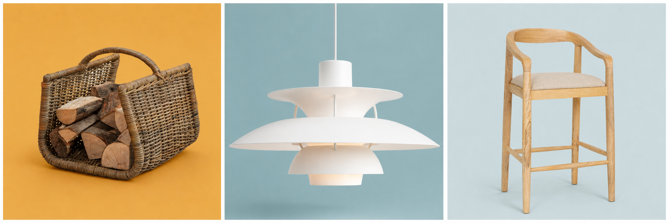
The SHAKER Kitchen Edit
Brass that ages. Light that glows. Linen at the window. Somewhere comfortable to perch.
SHOP THE TOWNHOUSE KITCHEN EDIT →Some links are affiliate links, including Amazon Associates links. I may earn a small commission at no extra cost to you.
The automatic side return. Not because side returns are wrong, but because more floor area is only worth having if the rooms are better. Ask what happens to the daylight, to the room in the middle, to the garden, and to the bikes and bins. The same goes for bifolds because everyone has bifolds, black grid doors because everyone has black grid doors, and wall cupboards because kitchens are supposed to have them. The best interiors often come from editing rather than adding.
Why it works
The room doesn’t rely on size to make an impression. The architecture stays legible, the practical things sit out of sight, and the character comes from materials that improve with age: timber, stone, brass, paint and fire.
Classic or contemporary?
A Victorian house doesn’t need Victorian everything. Find the mix that suits yours.
FIND YOUR EDIT →LIKE THIS?
Interiors, gardens, useful ideas and things I’d genuinely want at home. The Edit lands every other Thursday.
It depends on the orientation, the existing plan and how much you value the outside space. A side return can create an enormous space, but reworking the existing footprint gives better light, better proportions and a stronger authentic connection to the garden.
Not if you balance it. North light is cool and even, and warm, complex colours look richer in it than very pale shades. Here the dark base cabinetry is offset by lighter tall cupboards rather than one colour covering everything.
Yes, if the storage is properly planned elsewhere. Tall pantry cupboards, deep drawers, island storage and moving the laundry upstairs made it possible here. Downdraft extraction on the hob also removes the need for a hood on the wall.
Very. It’s hard-wearing and heat resistant, with a softer look than polished granite. The trade-off is that a honed surface shows oil and fingerprints more readily, so seal it well and wipe spills promptly.
Start with the plan. Look for redundant partitions, badly placed doors, underused utility space and narrow openings that restrict light or movement. Changing how existing rooms relate to each other can achieve more than adding a few metres on one side.
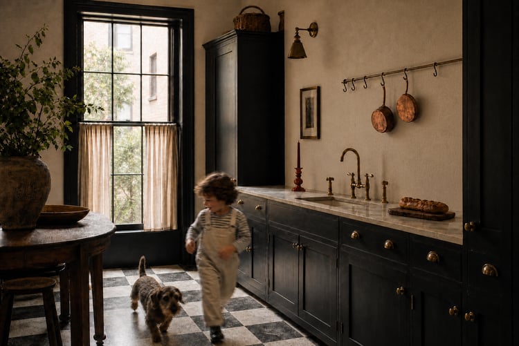
There is a fine line between a classic kitchen and one that looks as though Miss Havisham will pop...
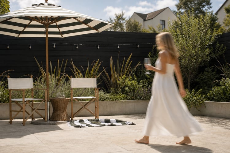
Stripes, shade and a long lunch, without the membership.
How do you make a room that isn't yours feel like it is?