

Kelly Wearstler, decoded: the six moves I keep seeing in her rooms
A curve against a grid. Stone beside metal. A 2019 bench in a 1930s Georgian bedroom.Kelly...
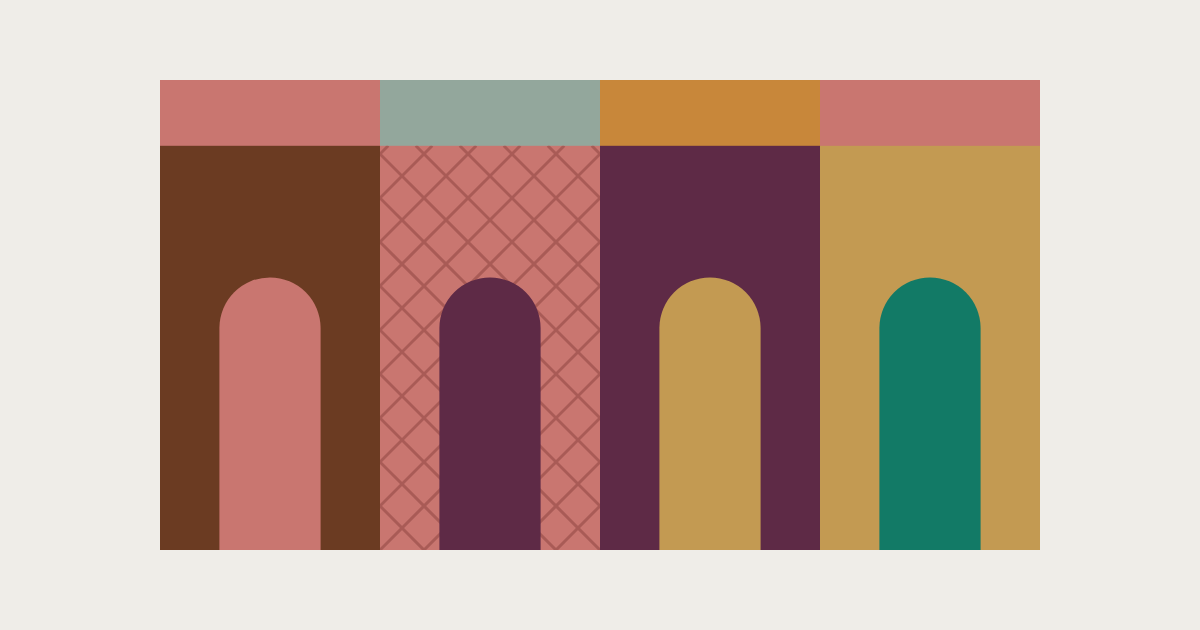
Dark, theatrical and impossibly inviting. Dimore Studio makes rooms that feel as though something interesting happened in them just before you arrived.
I looked across seven projects to see how it makes a room glow.
AD | This article links to an Edit with affiliate links. I may earn a commission if you buy through them, at no extra cost to you.
The six details
Six details, each with what I'd do at home. Tap one to jump to it.
Emiliano Salci and Britt Moran founded the studio in Milan in 2003, and they design the way a director dresses a set. A Mayfair supper club takes its cue from Wong Kar-wai's In the Mood for Love. A train becomes a run of richly coloured carriages, each its own scene. A listed Belgravia flat keeps every cornice and moulding, then is coloured, lit and layered until it glows.
Yes, it's theatrical. But these are rooms made to be lived in: to sink into, to linger in, to lap up. The drama is never there just for show.
I picked out seven of its most recognisable projects: homes in London, Milan and Saint-Tropez, a Mayfair supper club, a Brera trattoria, a grand hotel bistrot and a train. The secret isn't dark walls and purple velvet. It's how the whole room is made to glow.
This is my decode of the studio's work from the outside looking in. You may well see its rooms differently.
The designers
Dimore Studio
Emiliano Salci and Britt Moran
Interiors, furniture and lighting, Milan
The book
Dimore Studio (Rizzoli, 2018)
Shop my Edit, inspired by Dimore Studio →
01
Walnut, tobacco, chocolate and umber make the backdrop. Then the materials go to work: brass catches the light, lacquer throws it back, velvet soaks it up. That's the difference between a dark room and a rich one.
Not every project goes dark. Eaton Square sits on sage and stone, Caruso Nuovo is rich rather than dark, and the Saint-Tropez flat is full of sun. The brass and the lacquer are there all the same.
At home
Paint one wall and its woodwork in a deep, warm shade, then add brass and something lacquered to catch the light.
This is one of the two details I'd use in my own house. It's a smarter way to colour drench: the brass and lacquer bounce the light around, so the colour has depth and the room never goes flat.

02
On top of that dark base go the jewel colours: aubergine, plum, burgundy, oxblood. They're what you remember, yet they're surprisingly demure: in the photographs I measured, they never cover more than a twentieth of the picture. They sit on a velvet chair, a carpet, a lacquered sideboard, always from the same family as the dark behind them, only richer. In Salci's own flat the plum does go on the walls, but lacquered so deep it reads almost as brown.
A burgundy chair on its own is just a burgundy chair. Put it in the right room and it becomes the whole point.
At home
Start with a velvet cushion or lampshade in one jewel colour. Earn the chair later.
This is the other detail I'd use at home. Just enough jewel colour to anchor the room, never so much that it overwhelms.

03
The ceiling is part of the design, not the bit left white at the end. Saffron overhead at Caruso Nuovo, glossy terracotta coffers at Trattoria del Ciumbia, a different colour in every carriage of the Orient Express.
A white ceiling is where a dark room leaks its mood. Colour it, and the room closes around you like a theatre once the house lights go down. Add a soft sheen and the lamplight plays across it, bringing deep colours to life.
Even the exception proves the point. In the sunlit Saint-Tropez flat, in a 1930s building designed like an ocean liner, the ceilings stay pale, but they're still designed: a stepped oval over the sofa, a brass dish set into the kitchen ceiling. Dimore reads the place first, and on the Riviera the light does the colouring.
At home
Take the wall colour across the ceiling in a soft sheen, or at least pick out the cornice in a deeper shade.

04
Twin sconces, matching vases, a pair of armchairs facing across a table. Symmetry is Dimore's quiet organising principle: when the colour is rich and the materials compete for attention, a matching pair steadies the room. Kelly Wearstler often plays with near-matches. Dimore tends to commit.
When two aren't enough, it skips three and goes straight to a crowd: five silk lanterns in a row at Leo's, a line of 1970s lamps down Salci's own corridor, a ceiling full of Murano chandeliers at Eaton Square. Forget the rule of three.
At home
Two matching lamps on a sideboard. Save the row of pendants for a long table.

05
Curves run through almost every project: round tables, globe lights, oval ceilings, banquettes that bend. Then comes the counterpoint: a diamond. A harlequin bar front at Leo's, a trellis over palm wallpaper at Caruso Nuovo, a frieze of steel triangles locking into diamonds at Ciumbia, a lattice-fronted brass cabinet at Eaton Square, a harlequin wall closing the lounge car on the Orient Express.
At home it gets softer but never disappears: diamond cushions on the curved sofa in Saint-Tropez, a lattice rug in Salci's own flat. It's the grit in all that softness. Without it, the curves would turn sweet.
At home
A harlequin rug or a diamond cushion beside something round. Trellis wallpaper behind a round table only if you're feeling brave.

06
Each room, or each carriage, has its own colour, yet the same brass, the same dark timber and the same lamps run through all of them, so the mood builds as you move through. Nothing matches from one room to the next, but everything belongs.
At home
Give each room its own colour, and repeat one thing between them, a brass finish or the same lamp.

Which details appear in which project, and the colours of each. Four of the six turn up in all seven projects, the jewel in six and the dark base in four. Even where the walls aren't dark, the brass is always there.
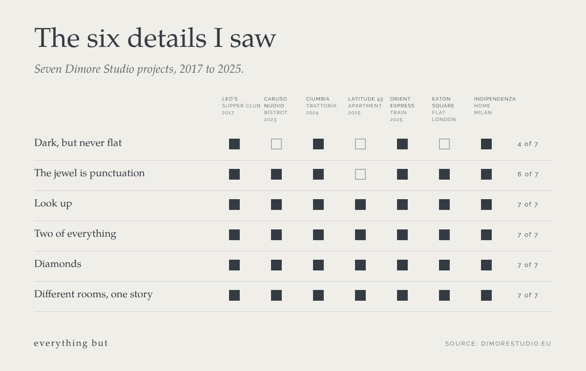
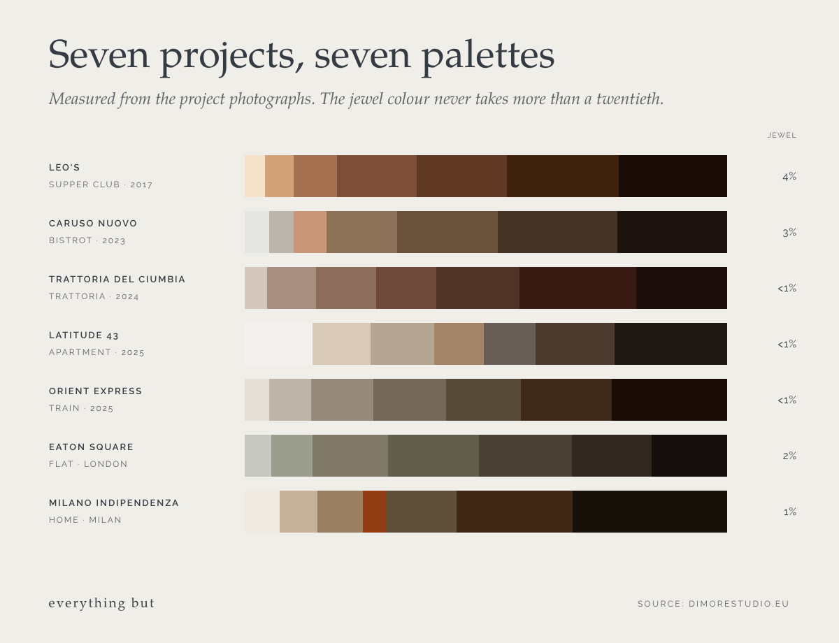
The projects: Leo's at The Arts Club, London (supper club, 2017), Caruso Nuovo at the Grand Hotel et de Milan (bistrot, 2023), Trattoria del Ciumbia, Milan (restaurant, 2024), Étage 3 at Latitude 43, Saint-Tropez (apartment, 2025), La Dolce Vita Orient Express (train, 2025), a flat in Eaton Square, London, and Milano Indipendenza, Emiliano Salci's own apartment.
How I did this I worked from the project photographs and details on dimorestudio.eu. For each project I logged the details and named pieces, and measured the colours in the photographs.
Why it works
Every room is built in layers, revealed bit by bit.
A warm, dark shell. Brass and lacquer to catch the light. A jewel colour on the soft things. A matching pair to steady it, a diamond to unsettle it, and the same threads carried from room to room. Look once and you see the colour; look again and you find the brass, the pair of lamps, the diamond in the rug.
What makes it livable is everything underneath the drama: the continuity, the depth of colour, the layering, the richness. It's considered, and it never feels like pastiche.
If you're trying to recreate it, the risk is that it tips into hotel, or worse, theme pub. Many of Dimore's best-known rooms are bars and restaurants, made to impress a stranger for an evening. At home the look needs to be lived in: books, family things, the odd chip in the lacquer. That's what turns a theatrical set into a home.
It's also more disciplined than it first looks. Dimore doesn't throw every era together. It picks a period, mostly mid-century Italy with the odd older antique, and commits. Even its own new furniture is drawn in that language. Choose your decade and stay with it.
And it works here. Two of the projects are in London, one of them a listed Belgravia flat, and both are beautiful. Jewel tones look as good under a British sky as an Italian one, as long as the base underneath is warm. Try it in a dining room or a snug first.
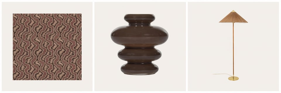
My Edit, inspired by Dimore Studio
My picks for each detail.
My own picks, inspired by the studio's rooms. Not affiliated with or endorsed by Dimore Studio.
SHOP MY EDIT →LIKE THIS?
Interiors, gardens, useful ideas and things I’d genuinely want at home. The Edit lands every other Thursday.
Start small: one warm, dark wall behind a brass lamp, a velvet cushion in one jewel colour, the cornice picked out in a deeper shade and two matching lamps on a sideboard. My Edit, inspired by Dimore Studio, has picks to start with.
A warm, dark base of walnut, tobacco, chocolate and umber, with one jewel colour on top: aubergine, plum, burgundy or oxblood. In the projects I looked at, the jewel colour stays under a twentieth of the room. Keep it off every wall: the jewel is the punctuation, not the sentence.
Yes. Eaton Square is a flat in a listed Belgravia building. Keep the cornicing, colour it, and take the colour up onto the ceiling.
Not if it's warm and well lit. Dark walls soften the corners, and lamps with a sheen overhead keep the room glowing. Avoid cold white bulbs and downlights: they flatten a dark room in seconds.
No. One good mid-century find from an auction does more than a roomful of new furniture. Pick a decade and stay with it.
The studio's own site, dimorestudio.eu, has every project. For the long read, its monograph Dimore Studio (Rizzoli, 2018) runs to 304 oversized pages of rooms, furniture and the studio's own pieces.
Spotted a detail I've missed, or think I've got Dimore wrong? Tell me on Instagram @everythingbut.theedit.
Project details from dimorestudio.eu. Illustrations by Everything But.

A curve against a grid. Stone beside metal. A 2019 bench in a 1930s Georgian bedroom.Kelly...
Colour is one of the quickest ways to change a room, and one of the easiest to lose your nerve...
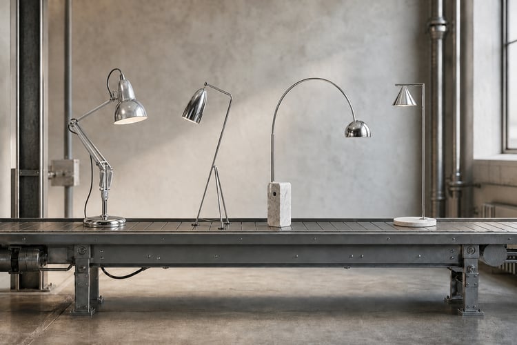
How the floor lamp learnt to become a statement
AD | This article contains affiliate links. We may...